So there is actually something worthy to read here
/ The Opportunity
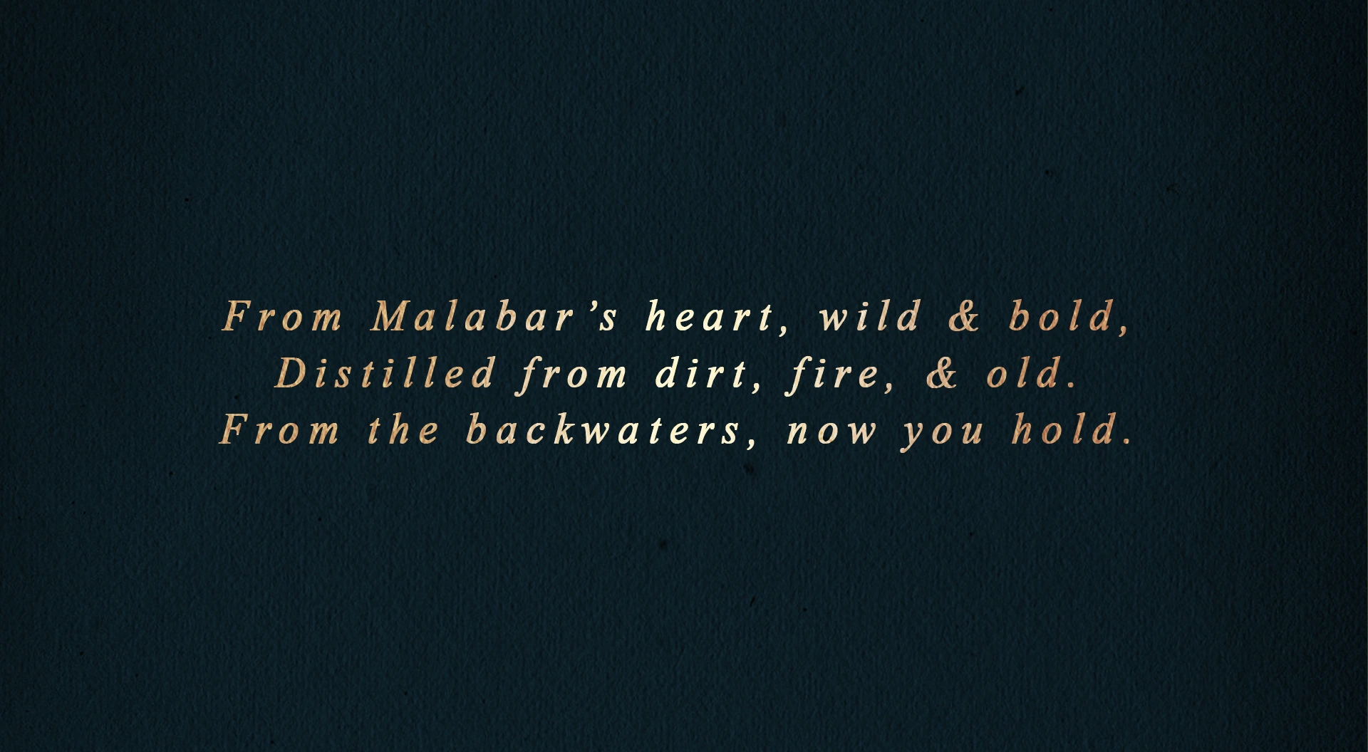
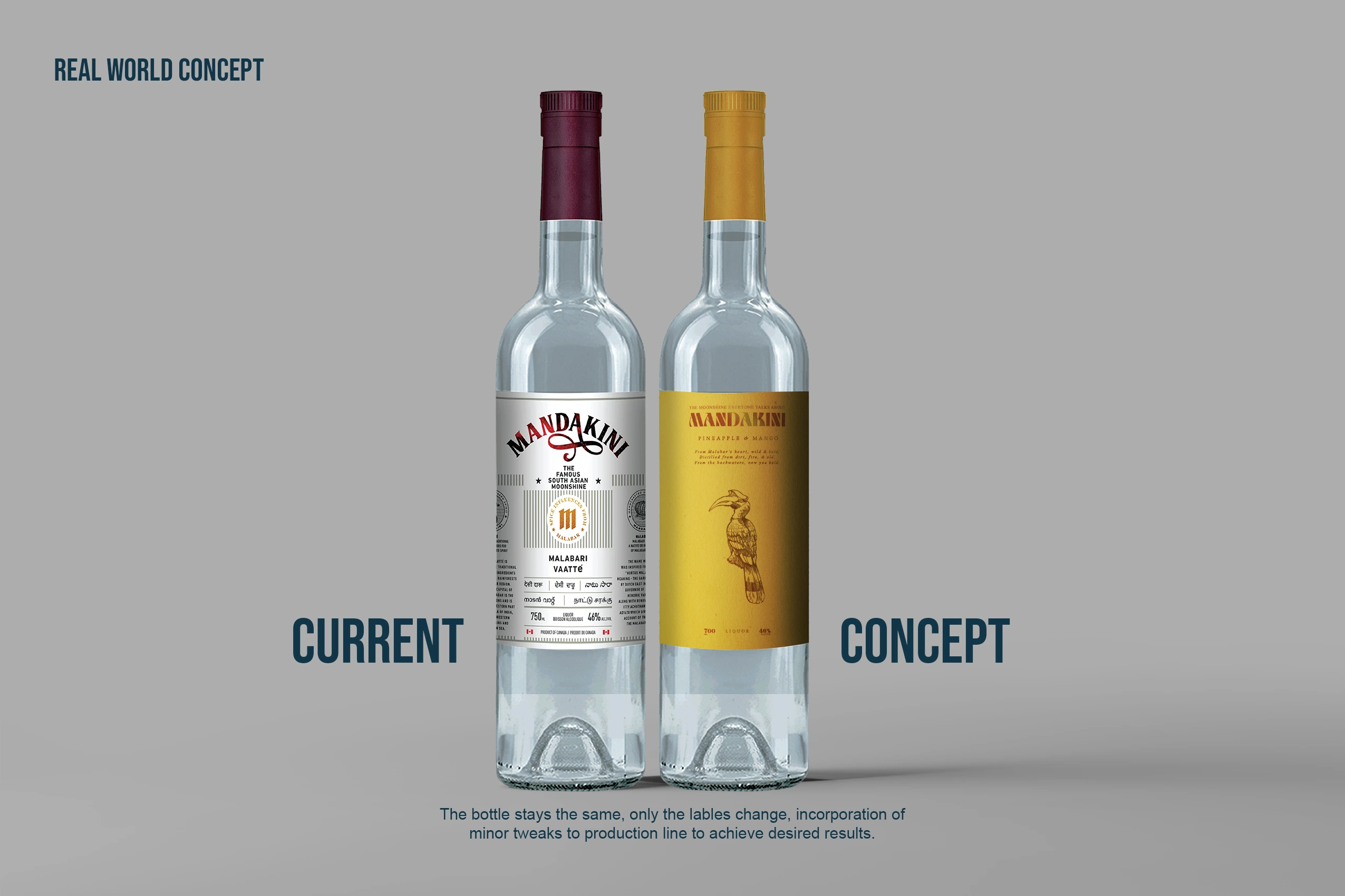
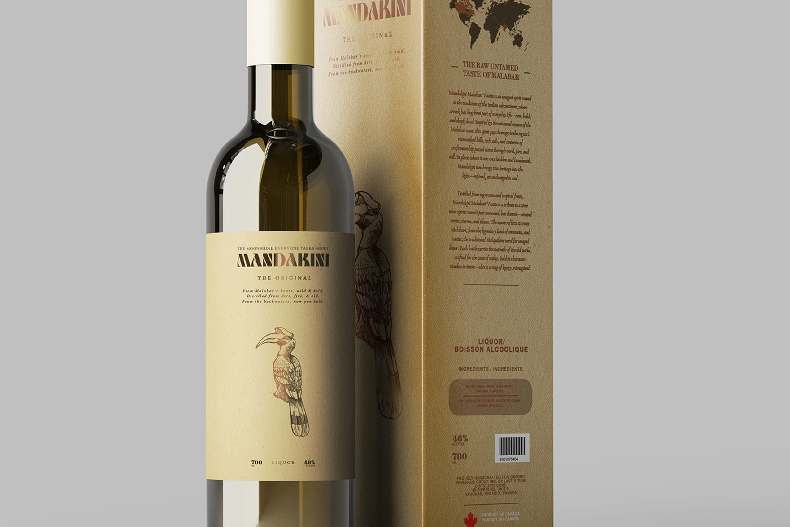
Mandakini already has a compelling story—traditional Kerala vaatte, regional heritage, and a product unlike anything else on the shelf. This redesign explored how stronger visual storytelling could make that story impossible to ignore, giving the bottle a more distinctive presence while remaining rooted in its origins.
/ Designing for the Shelf
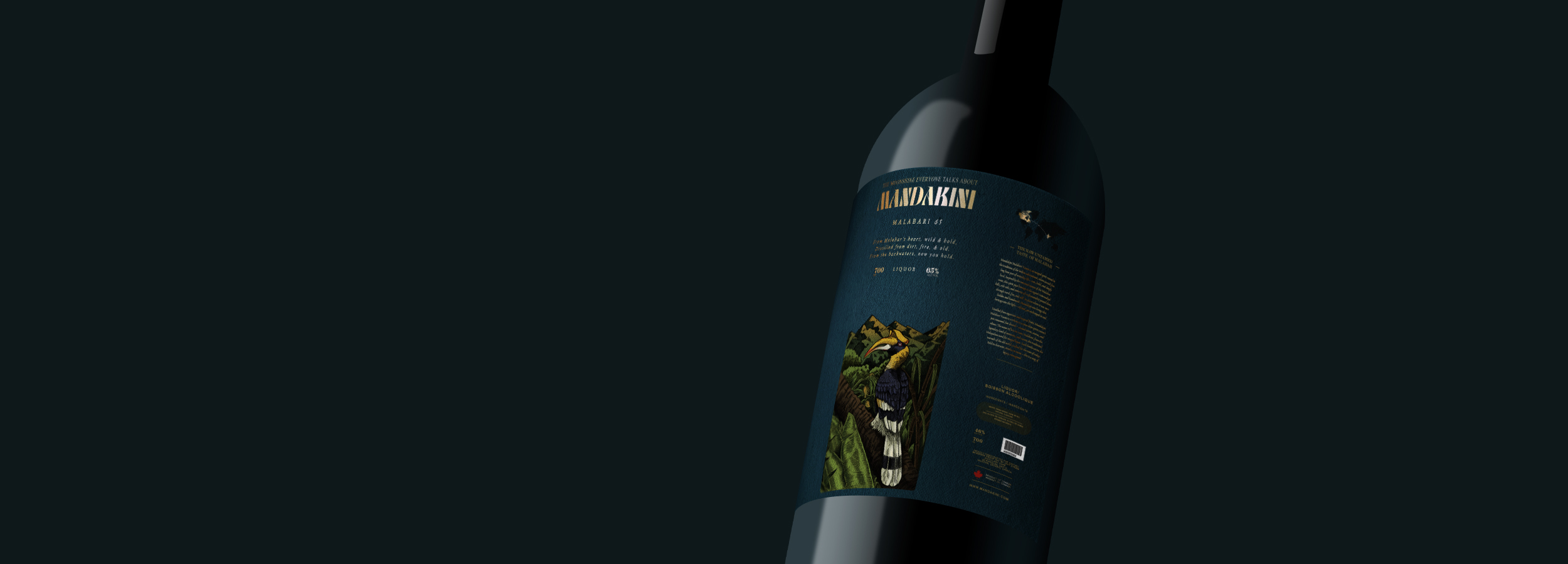
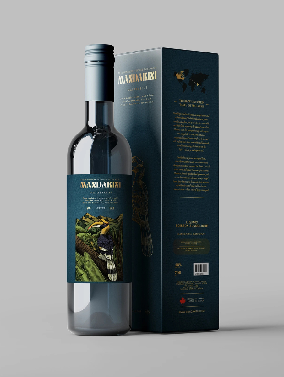
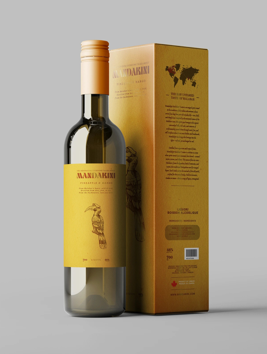
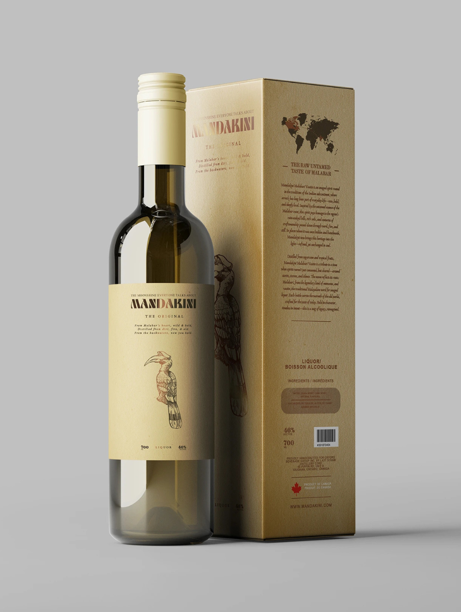
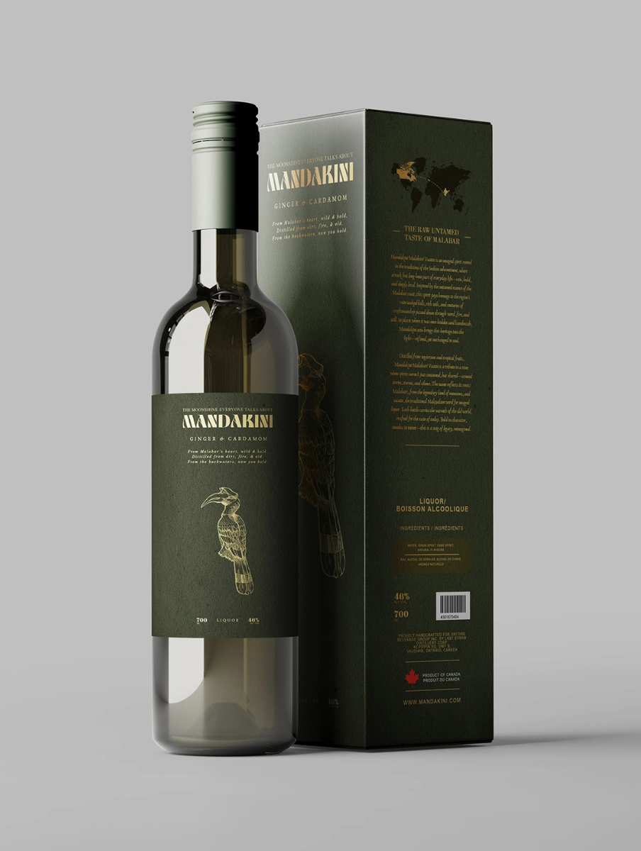
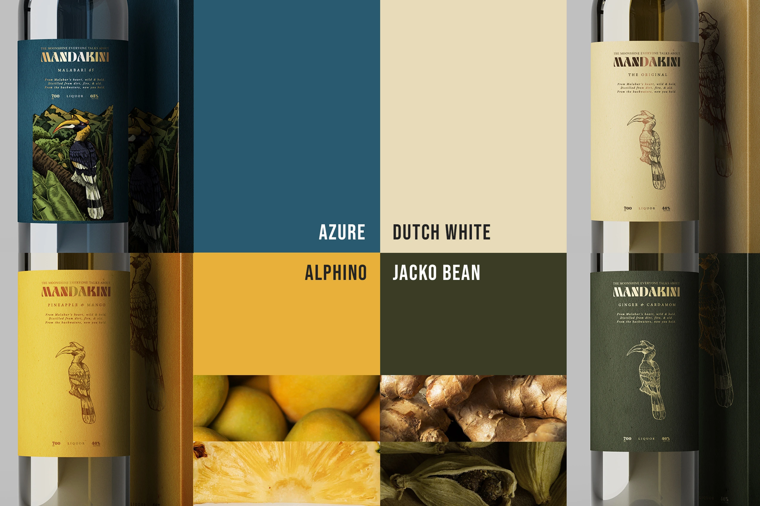
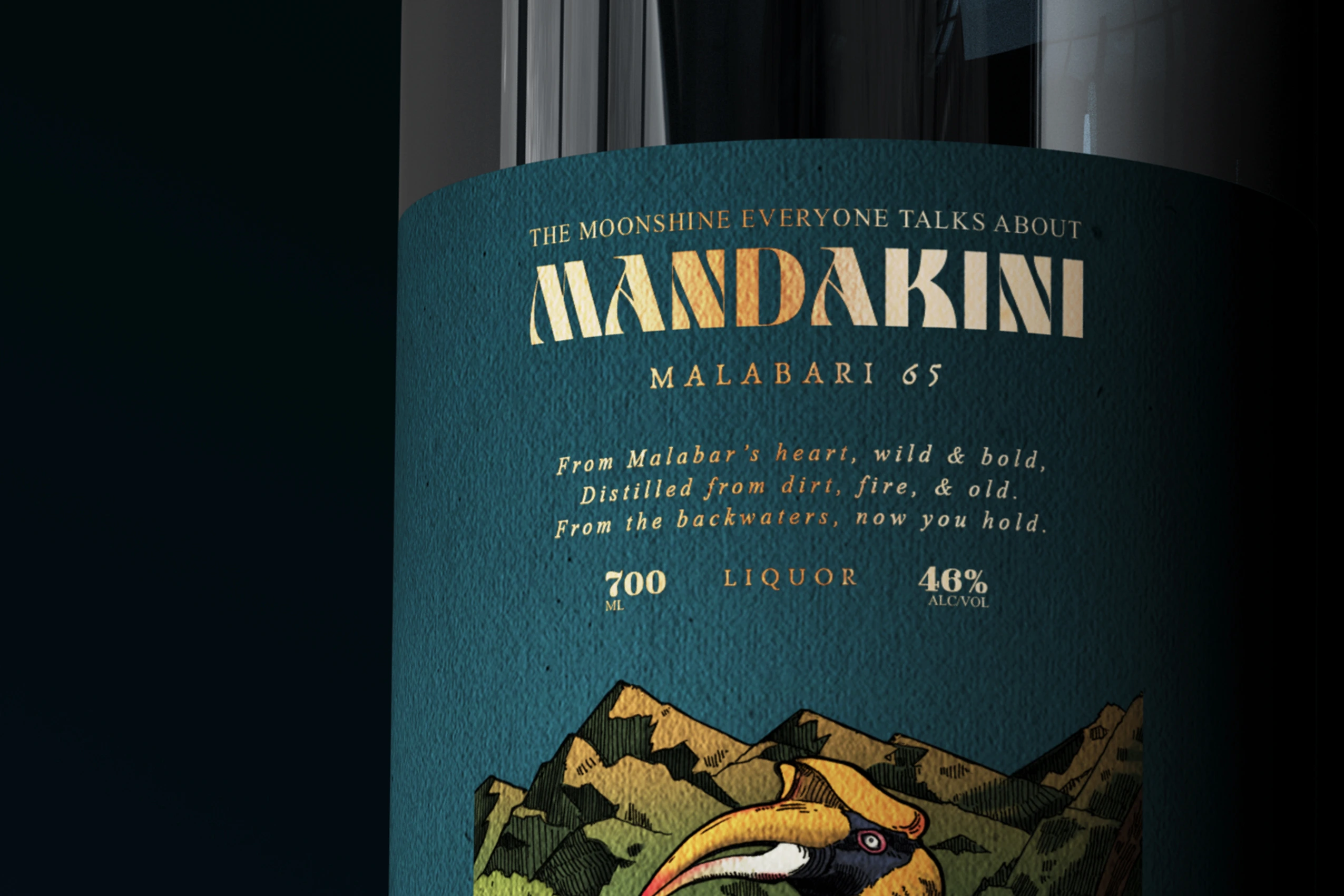
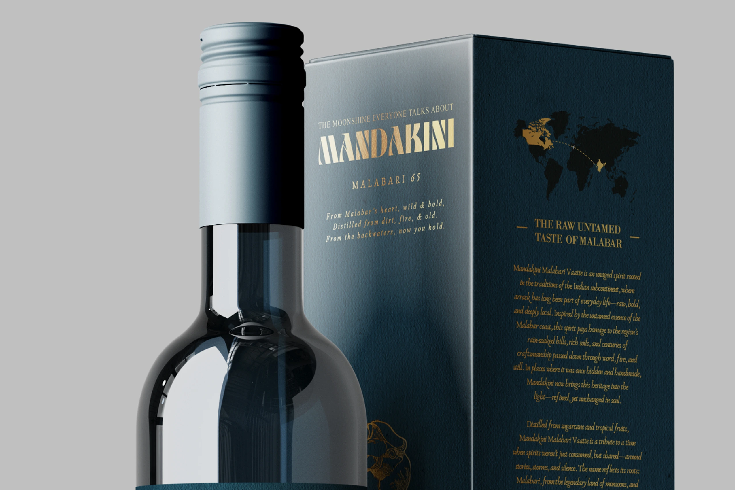
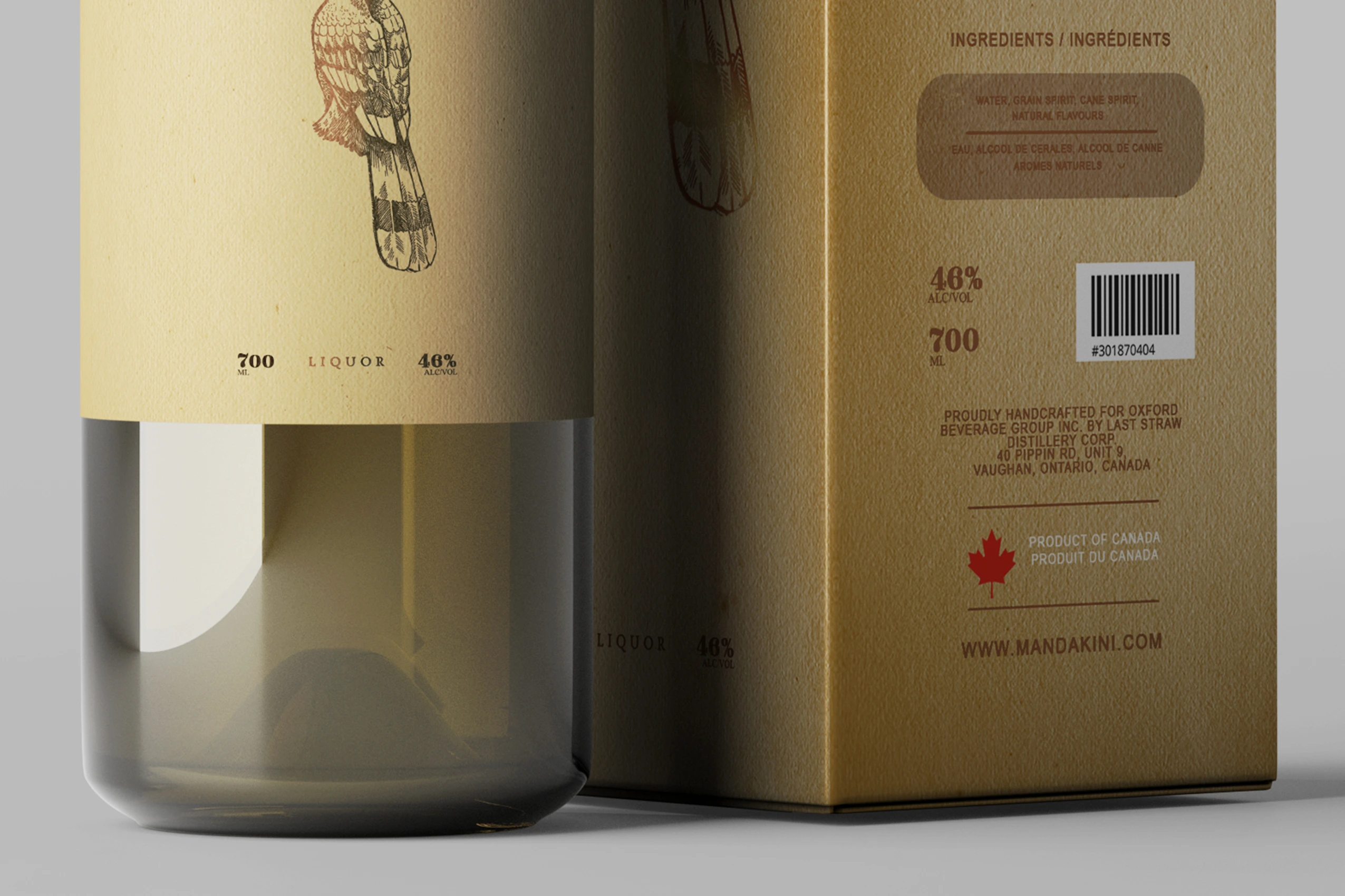
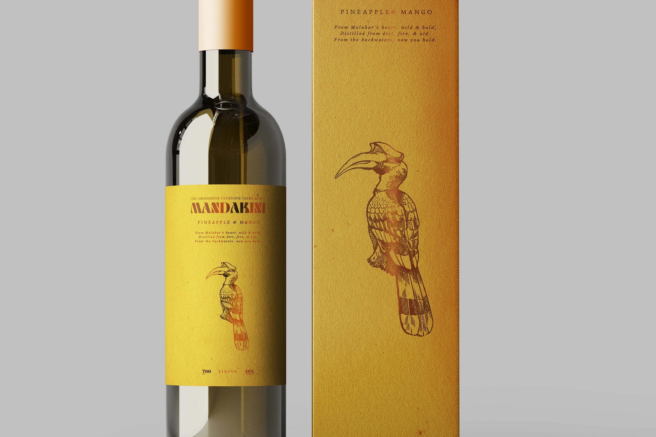
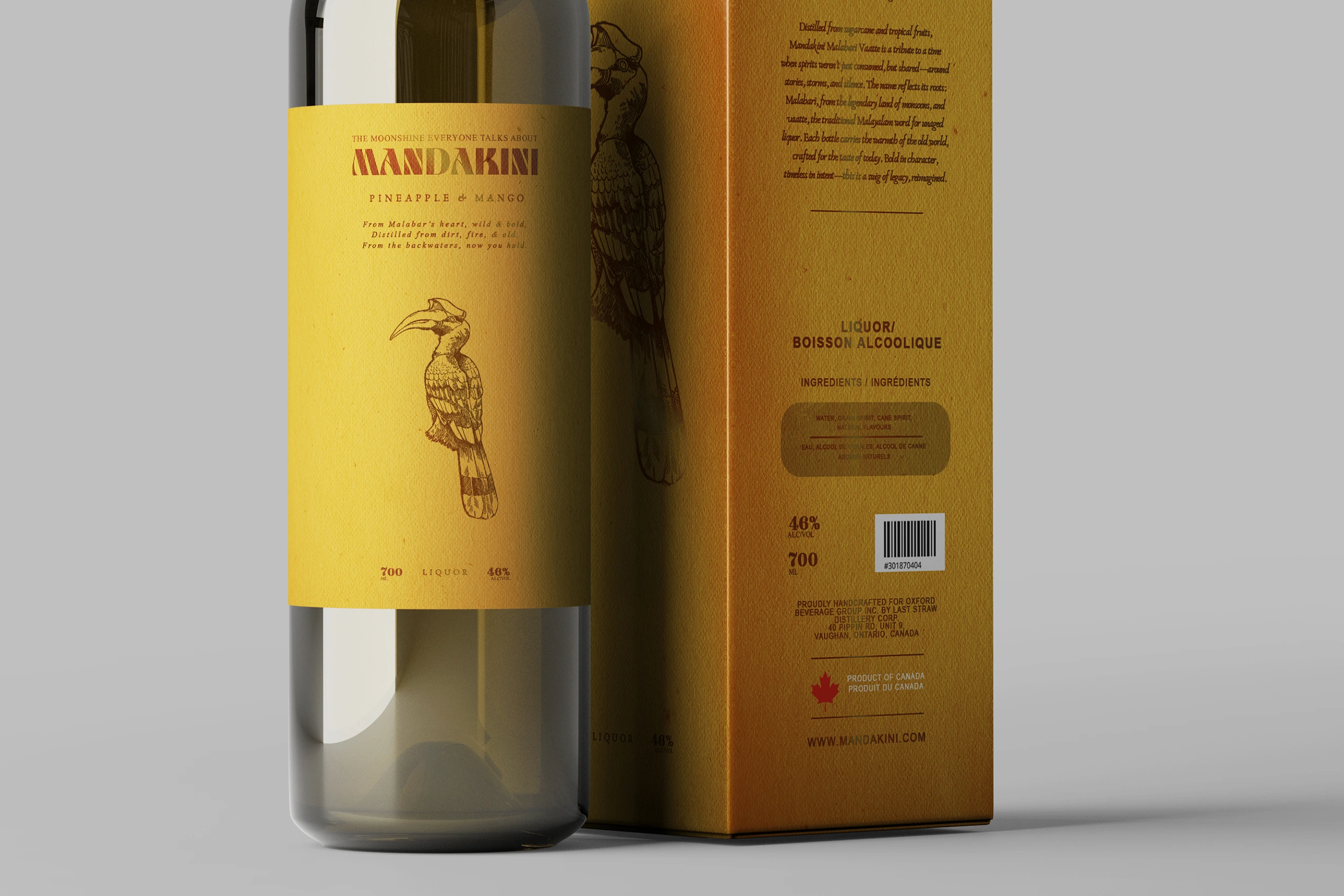
A bottle only has a few seconds to earn someone’s attention. Every design decision—from the bold typography to the illustrated landscapes and restrained colour palette—was made to increase shelf recognition without sacrificing authenticity. The goal wasn’t to make it louder, but more memorable.
/ Every Detail Has a Job
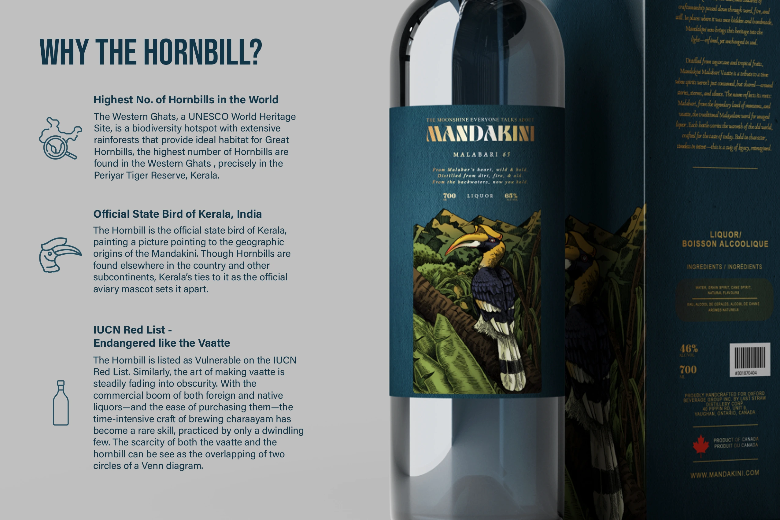
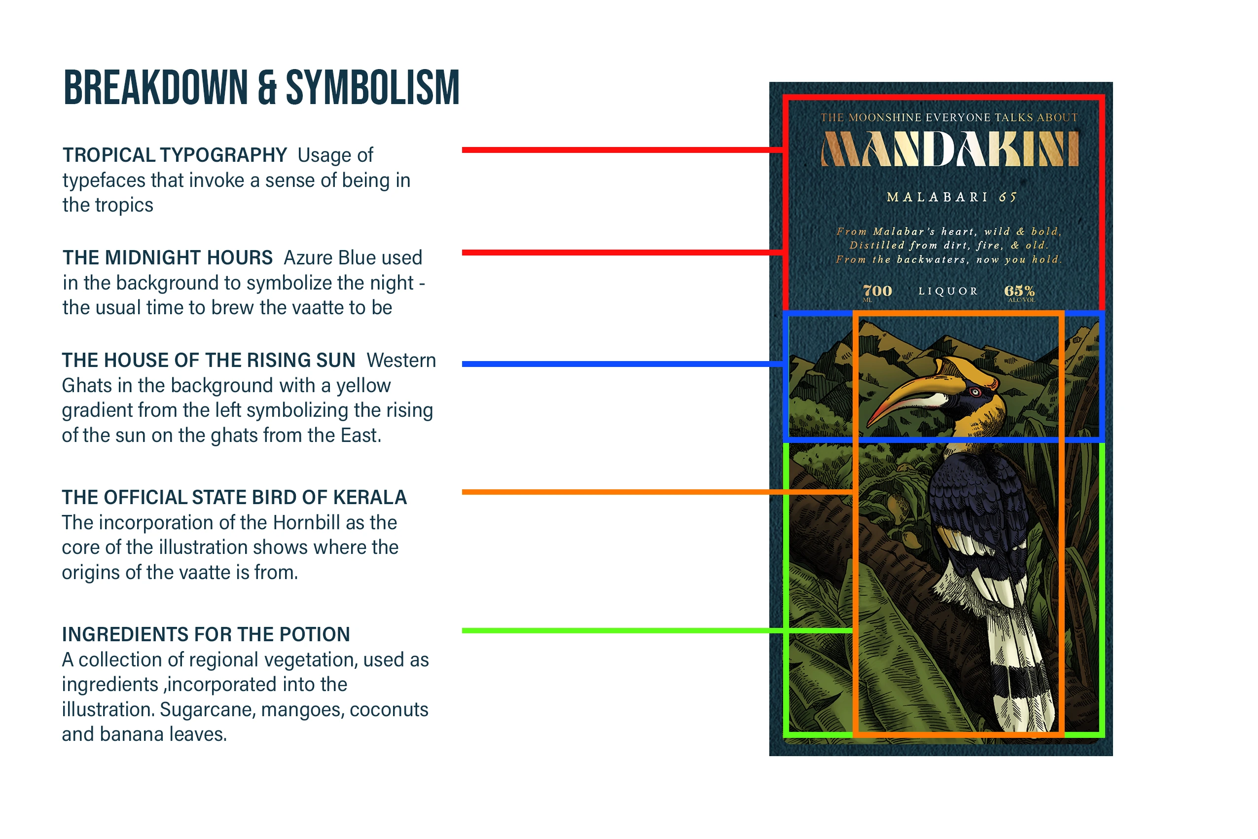
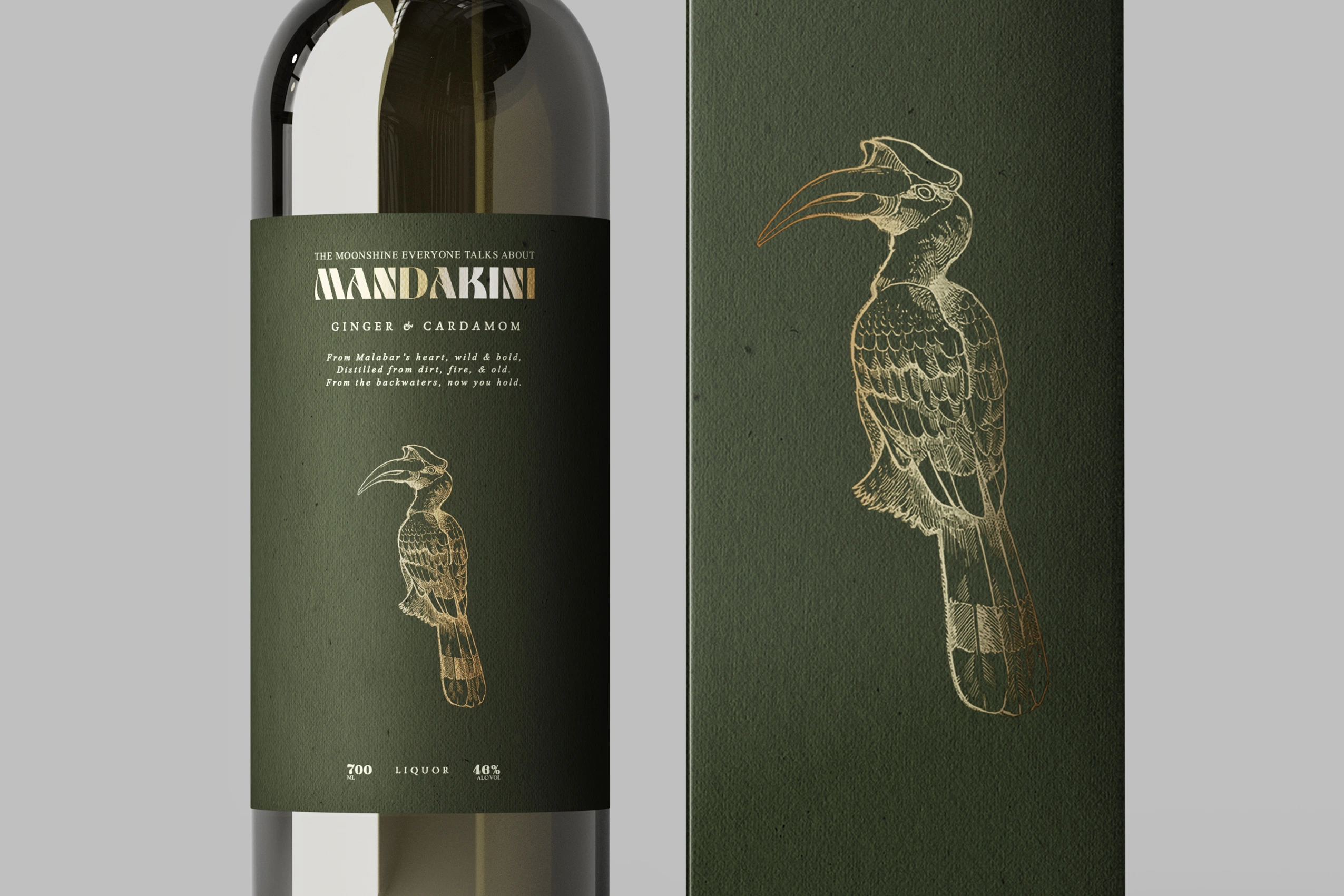
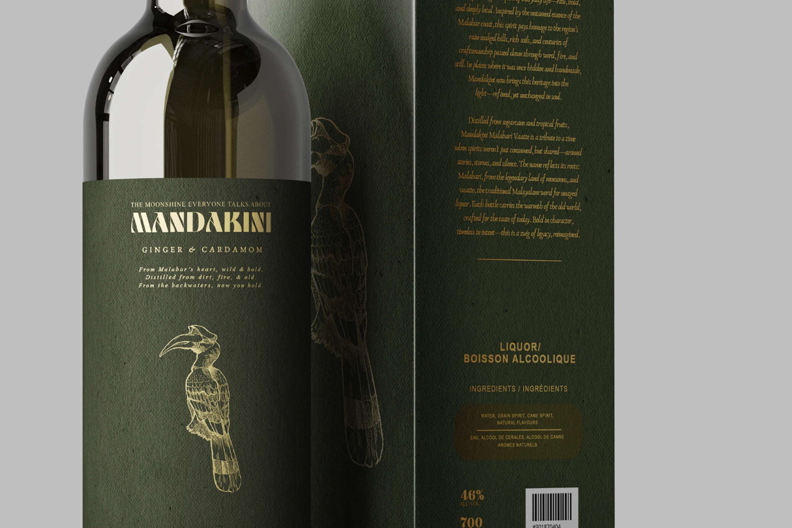
Nothing on the label exists just to fill space. The hornbill represents Kerala’s official state bird, the Western Ghats establish a sense of place, and the palette draws from the region’s forests, spices, and tropical landscapes. The branding becomes part of the story rather than something placed on top of it.
/ What Happened Finally
The concept was presented to the client and received positive feedback, but wasn’t taken forward due to budget constraints. Even so, it remains one of my favourite explorations in packaging design—proof that not every good idea needs to make it to production to be worth creating.